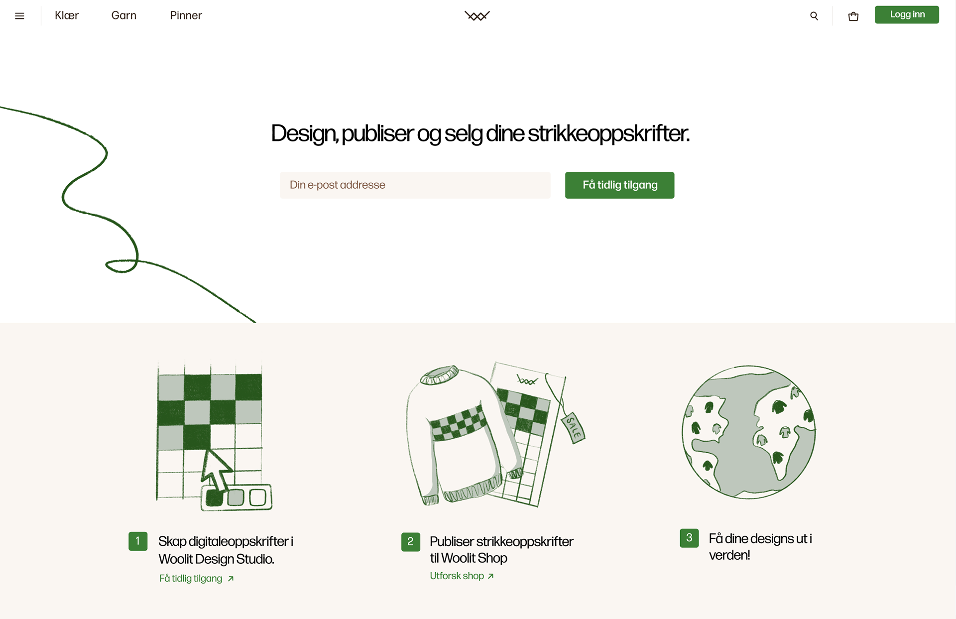
Since August 2022 until present day (December 2022), I have been working as the sole designer of Woolit on a wide variety of projects: from landing page and venture invitations for New York Fashion Week, complex product ordering flow, UX of color customization, and the home page of the site and app.
Here are some of the key changes made to the Woolit design —
Here are some of the key changes made to the Woolit design —
Ordering flow for multiple yarn packages.
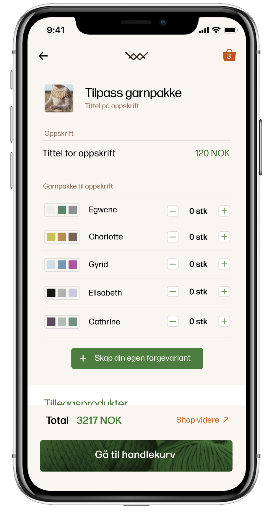

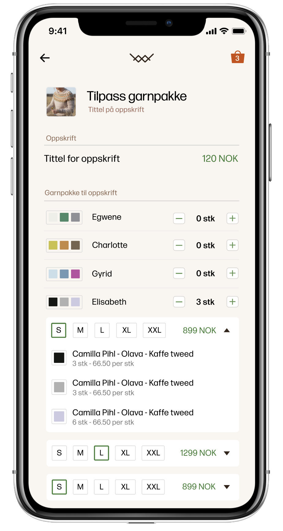
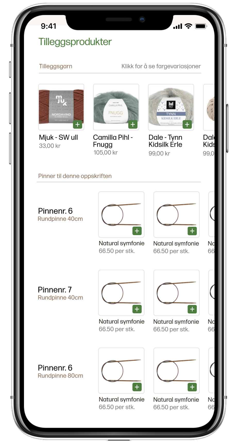
One of the most unique offerings of Woolit is customizable garn packages, in which customers receive a digital knitting recipe along with the exact amount of yarn needed in the colors of their choice. Not only was this a unique product offering which required a unique solution - we also wanted to make it easy to add multiple customized packages within one order flow. In this way a teacher could as easily order yarn packages for a full class, as a single individual ordering for themselves.
Another priority was to add relevant extra accessory offerings at correct points of the ordering flow, in order to meet customer needs without giving the experience of spamming products.
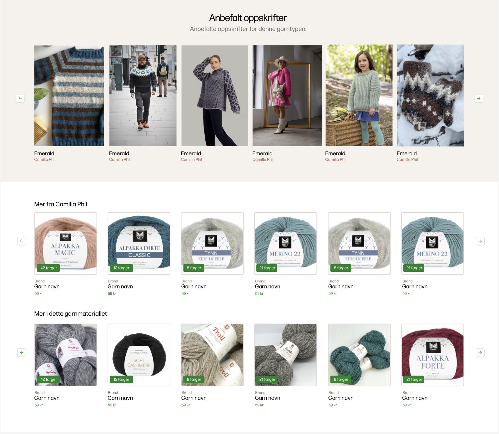
Under a chosen product, customers now receive suggestions to relevant products, yarn packages and knitting instructions.
Improving customer understanding of the Woolit ecosystem
Woolit is an ecosystem of hobbyist knitters, designers, and yarn producers. It is not merely a shop, but a platform where visitors will have to navigate themselves to where it is most relevant for them to be - whether that be the store, Design Studio, "my orders," "my recipes," etc. Because of the novelty of the concept, finding a way to quickly and visually communicate the broad, interconnected offering became a key focus.
In order to do this we created informative pages for each individual offering: for designers, about the app, FAQ. This will be linked together in the redesign of the home page (current WIP) to be more representative of the full ecosystem.
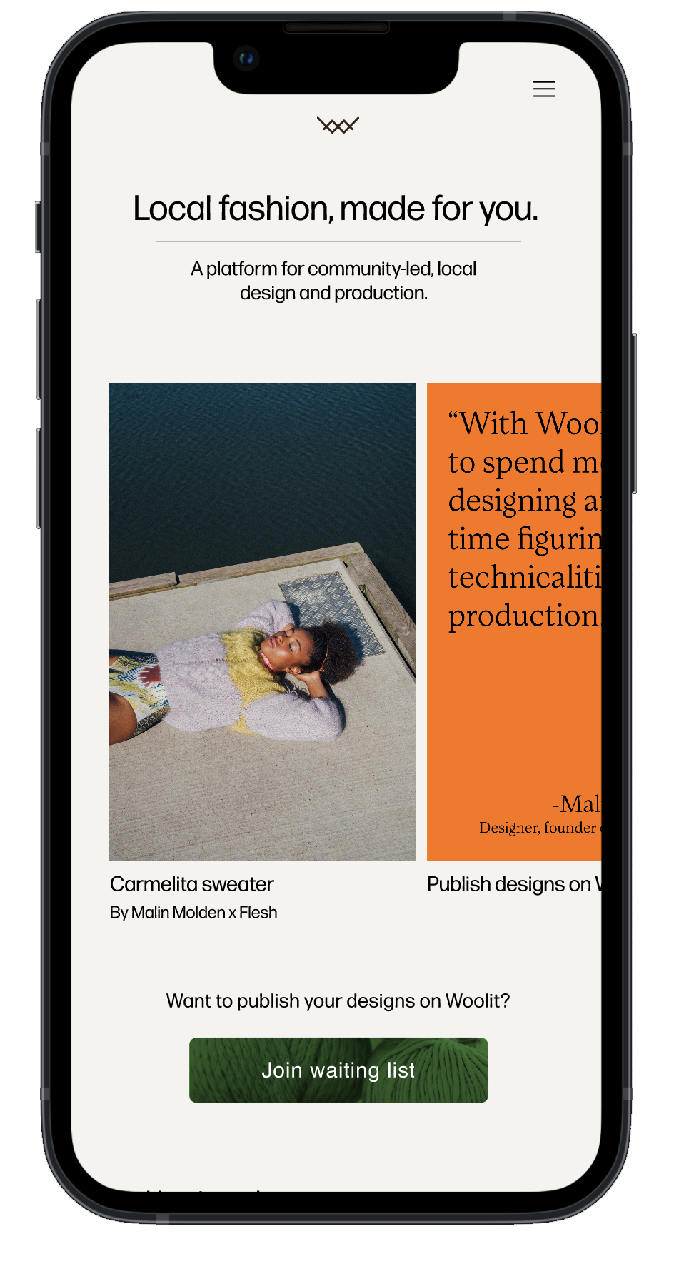
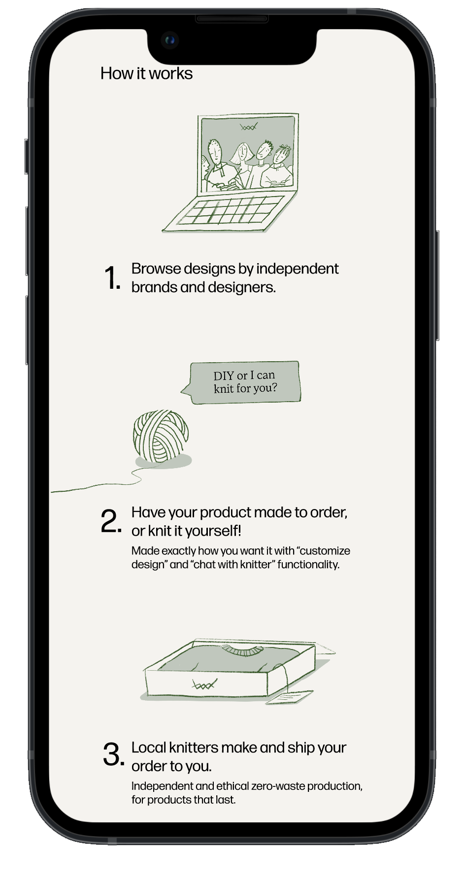
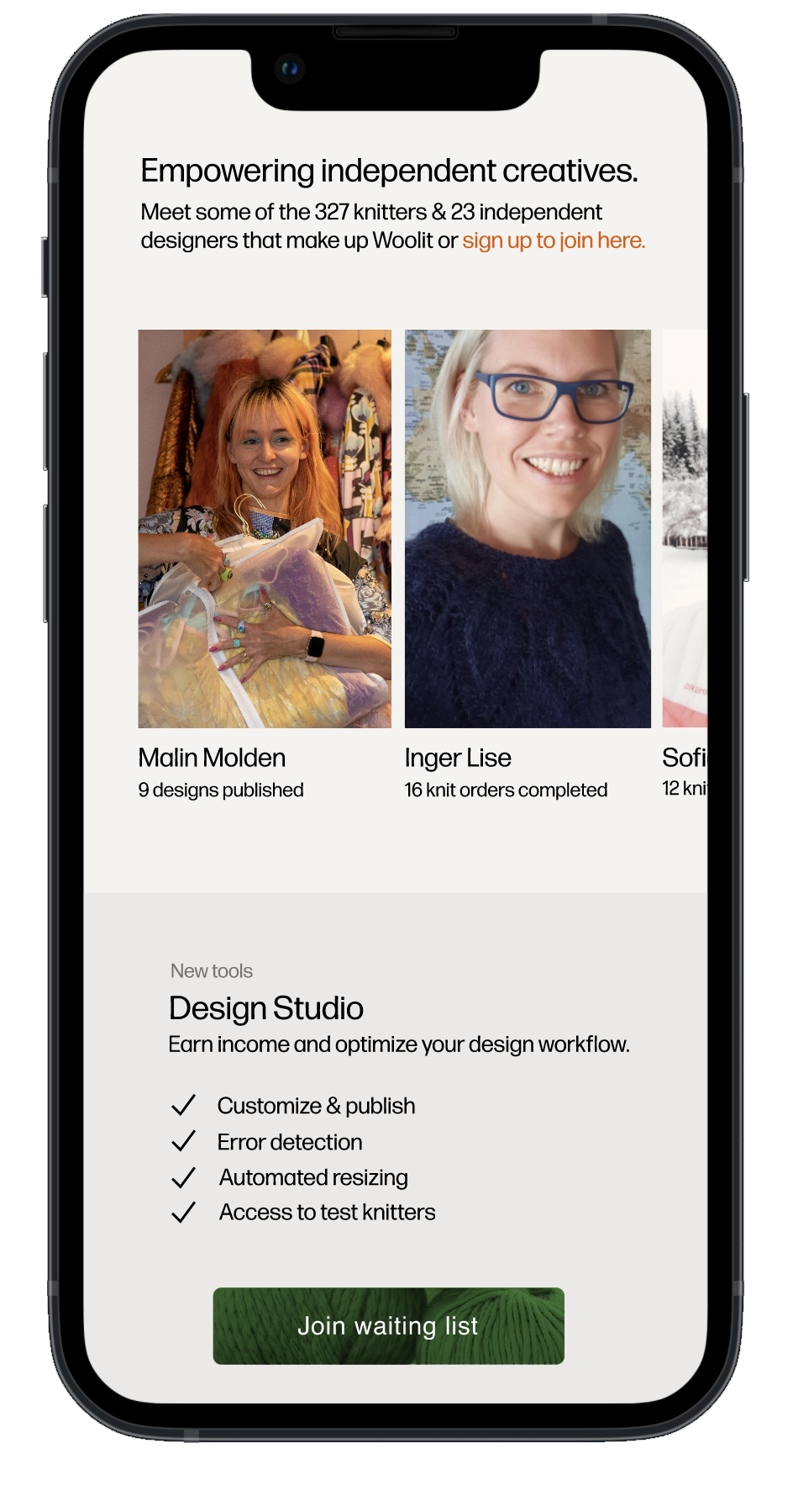

Woolit landing page for designers. This was presented at New York Fashion week 2022.
Woolit app and webpage redesign
Woolit wanted to modernize their overall design, in order to promote knitting also to younger age groups. To do this I introduced more playful colors like orange, illustrations, playful line work imitating yarn as a red-thread detail, and also prioritized more visualizations and personalized touches.
Another priority in this redesign was increased ease of navigation and less information overwhelm. This became especially important in the Woolit shop arena, in which there is a lot of different information and customization opportunities.
App home page before & after —
Yarn shop before —
Yarn shop after —
I found illustrations to be a great way to quickly communicate complex messages. For Woolit I created an illustration style that was friendly and playful, yet also unique and easily recognizable. Simple elements like the hand-drawn yarn thread became versatile and simple ways to create intrigue and lightness to the brand.
